Tuesday, November 3, 2009
Wednesday, September 30, 2009
Wednesday, May 13, 2009
Two Birds with One Stone
First project of my summer internship, as well as my motion graphics final for the semester.
This is still pretty rough... I made it in two days so things were rough, and I didn’t have time to embellish it with much detail. YouTube also forced me to render at pretty low quality to get it online. Oh well, its crisp in real life.
Thursday, May 7, 2009
What ‘made’ this semester (a limited overview)

Absolutely at the top of my list for inspiration for this semester is the work of Jakob Trollback. Simply amazing. An entire world of motion was unveiled to me through his work and has obsessed the vast majority of my extracurricular study this semester. Motion has interested me since last semester (fall 2008), but Jakob Trollback is operating on a completely different level. The intricacy that goes into every element of his work, both in how they are generated and also how they interact and are put together, have warranted hours and hours of careful examination this semester.
(also a big inspiration from videocopilot.com—moreso on the mechanics of the program)
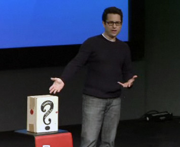
JJ Abrams talk on TED about the creative process behind LOST and his mystery box. Aside from my obsession with his creation, LOST, his notion of the mystery box really has effected my philosophy on design. Not knowing all the answers, essentially by leaving the mystery box closed, the imagination of what might be inside takes you so much further than what may actually exist. This is huge in design as we have the ability to reveal and hide items within our designs to take those viewing said designs to a completely different level than a simple explanation ever could.
Lastly, the Hallmark tour was a great picture of a large creative community at work, which I had never seen before. It was a truly exciting day for me: to see design in action on a massive scale. Everyone in that company has a singular purpose. Sure they work on cards, gift wrap, even web interaction, but they all seek after and create a highly creative environment. The whole day was one inspiring experience after another, but the best part of the day was sitting down to lunch and getting some time to speak with designers within the company. It was great to discuss our feelings on designs going on throughout America, what my interests were in design (print or digital) and how creativity is structured within Hallmark.
I know I’m being transformed in my thinking (or maybe just spending to much time working on projects—or both) when I dream about design almost every night (when I remember my dreams that is).
The Law Strangling Creativity

Larry Lessig's talk on TED about how the law is choking creativity brought up some interesting perspective historically to the current infringement battles. The greatest of which, a struggle between broadcasters, can give us hope that history will repeat itself and competition will trump those who currently seek to suppress recreation of copyrighted material in new, not pirated forms.
In reality though, in this digital world where creativity is becoming more democratized by the second, there are simply to many leaks in the dam to hold back the waters. This is the way the world is moving, or as Lessig puts it, this is the way the newest generations speak, and no amount of effort, legislation or otherwise, will challenge that. Ultimately this is why I think that what is defined in the lecture as common sense and a generation with a lack of regard for the laws are inherently tied together in this instance. Essentially those in younger generations, who have grown with technology and have a general sickness with the greed of corporate America see the issue of fair use as common sense, and thus are not sitting by for laws to catch up with what they already understand and practice.
I do wonder though if those wanting to continue to hold all the cards of creative content are not suppressing a future artist in the making, and consequently a future source of revenue.
Sunday, May 3, 2009
Monday, April 20, 2009
Design Matters.


He also helped redesign how the interface to the XM radio works.
 Recently he helped in the designing of the digital interface of Ford's SmartGauge that will be equipped on the hybrids arriving in 2010, designed to reduce fuel consumption by providing feedback to the driver on their driving performance.
 Debbie Millman is the host of Design Matters, as well as a board member of the national AIGA. She is a teacher at the School of Fine Art in New York and is the president of the design division of Sterling Brands. Design Observer is a website centered around all kinds of creative design (graphic, print, typographic, packaging design, etc...).
I listened to the podcast of Dan Formosa being interviewed by Debbie Milman. I thought that it would be an especially useful interview as Dan Formosa works with packaging design, and we are working on packaging design in GD1. The greatest thing that I think Dr. Formosa talked about was the psychological research that goes into their designs and how that shapes the final product. Sometimes he would make packaging that he knew would just shock the audience, but in most cases, group studies and interviews were used to determine what would be most widely accepted by a target audience. He was also very clear that his target audience could not be pinpointed down to a very narrow average, because as he put it, “If we make a door for the average sized person, then half the people who go through the door are going to hit their heads.” I think this is very insightful and an important thing to keep in mind when thinking about those that are receiving our designs. Not everyone who consumes the design is going to fit into a narrow and neat audience persona. The design can be targeted in a certain direction, but must be considered for and work on several levels for a range of people. The tighter a design is focused for a narrow band of people, the more often if will fail to reach many people and most of the time this is counter productive to a main goal of any given project.
Sunday, April 19, 2009


Here Comes Mies.
I have always been a fan of Mies Van Der Rohe's architecture (and the international style in general). His design of the Seagram building in Chicago is one of my favorite pieces of architecture the world over. Mies ascribed to the belief that “less is more,” which is something that I find extremely attractive about his designs. The work does not and should not scream out the the consumer, but rather be a harmonious and fulfilling part of their lives.
I see that in his furniture design as well. He takes what was very modern materials at the time and wraps them in very classic, inviting fabrics and leathers. They are meant to be a part of a home and the life that exists in that space, not a loud statement that overpowers the room, but rather exists in accord with it.
Mies Van Der Rohe is certainly best known for his impact on the world of architecture, especially in American architecture and the development of the International Style of architecture. His buildings were marked with clarity and simplicity. He was a pioneer in using modern materials to create a minimal framework and the feeling of freedom by using open interior spaces.
(bio)
Ludwig Mies was born in Aachen, Germany, to the wife of a stonemason in 1886. He attended the Cathedral School there between 1897 and 1900. In 1905 he moved to Berlin and, without formal architectural training, became an apprentice in the office of furniture designer (famous interior designer) Bruno Paul. In 1907, he built his first house as an independent architect, a wooden house in eighteenth-century style under the influence of English domestic architecture. Employed as a draftsman and designer in the office of Peter Behrens at the same time as Gropius was a senior assistant, Mies remained there until 1911. Among projects he worked on in Behrens's office were the German Embassy in St Petersburg (1911-1912) and an early study of a house (1911) for the art collectors Anton and Helene Kroller at the Hague in the Netherlands.
When Mies van der Rohe left the office of Peter Behrens, be was commissioned by Mrs. Kroller to prepare a new design for a house for the Hague, Netherlands. Mies van der Rohe worked for a year in Holland. A full-scale wood and canvas model was erected on the site, but the building was not built (A house was eventually built to the design of H. P. Beriage.)
Mies 's design for the house was derived from his study of the work of Kari Friedrich Schinkel (1781-1840). The project is known from drawings and photographs of the model and the mock-up. It was about that time that Mies, added his mother's family name, van der Rohe, to his surname for reason of its "sonorous" sound.
Reestablishing his practice as an independent architect in Berlin in 1912, Mies van der Rohe remained there until 1914, when he entered military service. After demobilization, he practiced architecture in Berlin until 1937. In 1918 he joined the Novembergruppe and served as its director of architectural exhibits until 1925. Mies van der Rohe became a member of the Zehner Ring. From 1926 to 1932, Mies van der Rohe served as first vicepresident of the Deutscher Werkbund.
In 1921, a competition was held for the design of a skyscraper on the Friedrichstrasse in Berlin. Mies 's scheme was forward looking, of great simplicity, in the form of three prismatic towers around a central core. The exterior was sheathed with glass. However, this project was not acceptable because the conditions of the competition could not be met with this solution.
There was no client for Mies 's proposal for a glass skyscraper (1922) in the form of a thirty-story tower designed for an irregular site located near the crossing of two broad avenues. The remarkable free-form plan sheathed in glass remained a strictly aesthetic study, without a solution for its structure. The project is known from photographs of a model, drawings, and sketches.
Dating of the proposal for a concrete country house is based on evidence that it was displayed in Berlin in May 1923 and at the Weimar Bauhaus in the autumn of that year. The proposal is known from photographs of a model and a few drawings. As this project shows Mies van der Rohe moving to a true "modem" style, it has always been of great interest. He undertook a number of studies of concrete buildings, including office structures at this time.
The plan for a brick country house in 1924 has a remarkable resemblance to the de Stiji paintings of Theo Van Doesburg. Mies van der Rohe was interested in brick as a traditional material and used it in the design for this proposed country house. Walls were free standing, sliding out from beneath the roof into the landscape. The walls connected to glass enclosures produced an entirely new effect, with radical implications for living style. Mies van der Rohe used these concepts to good effect in the Barcelona Pavilion of 1929.
The brick monument to Karl Liebknecht and Rosa Luxemburg (1926) in Berlin commemorated the ill-fated Spartacist 1919 uprising. Mies 's design was an abstract brick structure 6 m high, 12 m long, and at the widest, 4 m wide. Related to constructivist sculpture, it has also been compared to Frank Lloyd Wright's design for the Kaufmann house, "Falling Water." The five-pointed star and hammer and sickle completed the design. The Nazis ordered it destroyed in 1933. It was an exception for Mies van der Rohe to design a political monument, for he was normally nonpolitical. The commission came from Eduard Fuchs, president of the German Communist Party at that time. Mies van der Rohe was later attacked as a Communist because of this commission.
In 1927 Mies van der Rohe was director and designer of the Werkbund Exposition, "The Weissenhofsiedlung," overlooking Stuttgart. Sixteen architects of world renown, including Le Corbusier, Peter Behrens, Richard Docker, Hans Pelzig, Hans Scharoun, and Walter Gropius were commissioned to design and build 320 white houses. The houses were of the very latest design, using the most recently developed materials. This was the first housing project to be built in Europe using designs that were the last word in modernity - flat roofs and cubic forms. Glass and concrete were the main construction materials. The houses were built taking into consideration the latest ideas in communal living that psychologists and sociologists had devised.
This success was followed by Mies 's appointment as Director of the German Section of the International Exposition in Barcelona, Spain. The pavilion was awarded to Mies van der Rohe in the summer of 1928 because the Weimar Republic wished to present itself as progressive. It was used as an information and reception center and was opened in the presence of the Spanish King Alfonso XIII and the royal family. Demolished in 1930, the building is known from photographs. Reconstructed in Barcelona in the 1980s, this icon of modem architecture may now be experienced in facsimile on its original site. Many feel that Mies 's fame would have endured on the basis of this one building. The Barcelona chairs designed for the pavilion, originally in white leather, remain in production and have been widely used in the United States.
Mies van der Rohe became well known for the glass and steel, "skin and bones" clarity that the Barcelona Pavilion expressed as well as the planar inner walls that are an outgrowth of the belief that space must be made universal and flexible.
The luxurious Tugendhat house in Brno, Czechoslovakia (1930) was the largest designed by Mies van der Rohe. On a sloping site, the building is a compact two-story plan, entered from the street at the upper level. The free flowing spaces of the living and dining areas give this house much of its quality. Its use of exterior terraces on both levels is omparable to Le Corbusier's Villa Stein in Garches, France, of 1927. Programmatically, the house is similar in function to large, late nineteenth-century country houses. Individual spaces could be shut off using draperies on ceiling tracks. The curved wall denning the dining room is Macassar wood, with an onyx freestanding wall denning space between living area and study. The Brno chairs designed for this house are still produced. The house suffered damage and is now owned by the city of Bmo. Restoration of the house was begun in 1986.
All of Mies van der Rohe's furniture designs, with the exception of some studies, occurred in his German period. He worked for many years with the interior designer Lilly Reich (1885-1947), but the designs bearing Mies 's name are considered his own. These pieces are well known because they were sold by Knoll Associates in the United States. Well-known pieces include the Barcelona chair (1929). MR chairs (1926), Tugendhat chair (1930), and Brno chair, couch, and coffee table (1930). Other pieces were simple tables based on the careful selection of materials rather than on new technology. In 1930, Gropius recommended Mies van der Rohe as successor to Hannes Meyer (1889-1954) as director of the Dessau Bauhaus. During that period Mies van der Rohe was also director of the Werkbund Section, "The Dwelling", of the Berlin Building Exposition of 1931. In that year Mies van der Rohe was made a member of the Prussian Academy of Arts and Sciences. When the Dessau Bauhaus was closed by the Nazis, Mies van der Rohe moved it to Berlin in 1933, but again the Nazis closed the school; the faculty dispersed on August 10 of that year.
In 1937, Mies van der Rohe made his first trip to the United States, followed in 1938 by his immigration there. Mies van der Rohe was appointed Director of Architecture at the Armour Institute in Chicago (since 1940, the Illinois Institute of Technology). In 1944 Mies van der Rohe became a U.S. citizen.
With the establishment of a new campus for the Illinois Institute of Technology, Mies van der Rohe had the opportunity to plan the campus as well as several of the buildings. The first structures, started under wartime conditions, were variations on steel-framed one- to three-story buildings with brick end glass. The care in detailing intersections and corners gives the buildings distinction. The simplicity the chapel (1952) is noteworthy, as is the last of the buldings designed by Mies van der Rohe for the campus. Crown Hall (1950-1956). The latter building is an enormous room, 120 x 220 ft in plan, 18 ft high without interior columns, used for the architectural school. The building is raised several feet above the ground to allow light for the belowgrade School of Design. The most interesting point is the structural solution of exposed structural beams above the roof, making dear the method of achieving the clear-span interior. Mies van der Rohe ended his relationship with the school in 1958.
Dr. Edith Farnsworth commissioned a house from Mies van der Rohe in 1946 for weekend and vacation use, on the Fox River, Plano, Illinois. The house is a simple glass pavilion on a raised platform; the exterior columns make the roof and platform appear to float above the site. Construction started in 1949. Before completion, Dr. Farnsworth brought a lawsuit against Mies van der Rohe that was settled in Mies 's favor. This experience may have contributed to the fact that Mies van der Rohe concentrated on large building types after this.
The 26-story 860-880 Lake Shore Apartments in Chicago (1948-1951) were an important advance in high-rise design. Based on a 21-ft bay, the structural cage is clearly expressed, with spaces between structural members in glass. At the ground level, service and lobby areas are set in from the columns, providing covered walk areas. For appearance, I-beams were welded to columns and mullions. This use of steel for decorative use was an aesthetic decision. White draperies against the glass gave a uniform appearance, with the possibility of interior draperies for individual selection. The buildings continue to look well, better than most buildings of their age. There has been extensive published commentary on these and other apartment towers designed by Mies van der Rohe.
In 1953, Mies van der Rohe introduced Gropius at a fete marking the latter*s seventieth birthday, tracing their long association, and lauding Gropius's contributions.
The Seagram building on Park Avenue in New York City (1954-1958) was set back 90 feet from Park Avenue and 35 feet from the side streets. It rises in a simple shaft to 39 stories. More space could have been built on the site under zoning laws, but the client agreed to the reduction in floor space. Lower structures behind the tower close off the center of the block. The plaza on Park Avenue, raised from the street, consists of simple stone paving flanked by pools. The walls are a bronze curtain wall, and the finish throughout was carefully designed by Mies van der Rohe. The building has landmark status.
The Toronto Dominion Centre is related in concept to the Federal Center in Chicago and Westmount Square in Montreal. Mies van der Rohe most carefully considered the design of the Toronto project; the other two were carried out by his office under his direction. Asymmetrical groupings of towers on a plaza, the buildings have remarkable similarities despite variations in function. This prototype approach was congenial to Mies van der Rohe, and in Chicago it was played off with the one-story post office pavilion. The clarity of detail and care in design of the walls make these typically Miesian buildings fit their urban settings well. In the Canadian projects, the underground shops, parking, and ties to transportation systems (in Montreal) were important urban considerations.
The New National Gallery for Berlin (completed 1968) was a late work, derived in concept from earlier studies for museums and the Bacardi office building project in Cuba, never built. The roof structure and supports are the essence of the building. Exterior columns were carefully designed, standing in front of an all-glass wall. The entire roof was raised in one operation, high enough for the columns to be placed on their foundations; the roof was then lowered onto pin connections. The immensity of the enclosed space has made it a difficult space for art. It is more an expression of Mies 's aesthetic, and is its own exhibition.
Mies van der Rohe was awarded the Gold Medal of the Royal Institute of British Architects in 1959, the AIA Gold Medal in 1960, and the J. Lloyd Kimbrough Medal in 1961. Mies van der Rohe was the first architect to receive the American Presidential Medal of Freedom, in 1963. Mies van der Rohe was the recipient of prizes from the city of Munich and the German state of North Rhine-Westphalia, and from the Bund Deutscher Architekten in 1966. After a long illness, Mies van der Rohe died in Chicago on August 17,1969, at the age of 83, only a month after the death of Walter Gropius.
One of the great masters of early twentieth-century architecture along with Frank Lloyd Wright and Le Corbusier, Mies van der Rohe made a major impact on the look of U.S. cities. His wide acceptance by corporate America brought him more important commissions than Mies van der Rohe had received in Germany in his earlier days.
His elegant curtain walls were widely adapted by others using less expensive construction, giving rise to the glib phrase "less is a bore." Mies van der Rohe has been criticized because his buildings, although appearing machine-made, were in large part built by hand. Mies van der Rohe was accused of paying small attention to functional demands, such as ignoring excessive solar gain through glass walls. Mies van der Rohe was also described as insensitive to neighboring structures and to environmental concerns. Critics have claimed that his best work was the design of undifferentiated spaces such as lobbies, convention halls, or open office floors.
What is likely to be his lasting impact was Mies 's concern with theoretical concepts, clarity of image, careful attention to detail, and lightness of proportion. These architectural concepts will survive.
Monday, April 13, 2009
Videos - Paula Scher, David Carson, Milton Glaser
I have never really found a point listening to Paula Scher in the past that I REALLY felt like I connected with, until today. I really loved how she talked about her inspiration being intuitive. That in a moment she has an idea and that the idea may come in a second, but that it is 34 years of everything she has ever experienced coming out in the first attempt. Its great to hear someone say that the first gut reaction isn't always wrong, that at times it doesn't take a 1000 varriations to find the one that works. I loved her citi bank example and would probably ask her to explain how this intuitive reaction has produced other projects.
I think David Carson speaks to this as well. His lack of initial experience allowed him to do spreads that intuitively felt right to him, not what rules were right typographically. I would ask him, for someone who is going through formal training and learning the rules, what should I do to learn to break free from these at times?
I love how Glaser talks about the passing of gifts that cannot be held, but must be passed on. What a beautiful way to look at the art of communication. That it has a pacifying and unifying element unlike any other area of expertise and that the messages that we do pass on should not be ones meant to do harm. We have an amazing ability to transmit effectively a thought from one point to another. He also talks about losing the ability to be astonished and that he has managed to retain astonishment, how should someone go about insuring that astonishment remains?
Cult of the Ugly
I read the high ground design article, the interview with Steven Heller, and Overcoming Modernism.
I really liked the interview with Steven Heller, as I think it gave good insight into the cult of the ugly essay. Mainly, I liked the point that a purpose of the essay, in some form, was to seek open dialogue. Its not only healthy, but essential for an industry to have individuals willing to place a reality check of sorts on their peers and then to have those fellow designers either affirm the call to action, or make a response of their own feelings in search of the truth. In this way we as a design community can effectively move forward to where we see our purpose best accomplished, namely the communication of any given message to an appropriate audience.
This is not to say that there should only be one answer for design at any current time, but that the dialogue is imperative to the industry as a whole and its ability to create movements, reactions, and follow the ebb/flow that creatives have always made in history.
I also found some interesting points in this portion of the Overcoming Modernism article:
"The pressure on the young designer today is not to become a star, a master or mistress of the universal, but to become a participant in communication process, a co-conspirator, a co-author, maybe even an author/designer. This is why the development of the personal voice or agenda has emerged as an important new aspect in the training of young designers today. Their educational experiences should equip them with this expanded, much more accountable role that will be demanded of them if they are to retain any validity in a new context."
"But what about the old folks, the old guard, or those of us who straddle the two guards? We are the ones who, in the last 15 years, have complained that graphic design had an inadequate body of theory and history to guide its own development; but ironically, as more theoretical and historically informed ways of thinking about graphic design have evolved, our heroic Modernist dreams have gone to hell in a hand basket. We're distressed, we're unhappy, we're in pain! What should we do?"
To the last point: What should we do? ... or rather what haven't we been doing? I think a key to success is remaining teachable, even if you have been practicing for 15 years... it may be even more important in that case. I also really liked the note that it is ok, even better, to seek after the goal of design (communication) rather than some lofty figure head. Not that each industry should not have such as an essential part of its hierarchy, but the bulk of the work, that which continually drives the communication art, should not be done by those that are seeking anything other than the reward of success in delivering said message.
Monday, April 6, 2009
Futura

Im personally not opposed to Futura, but for some reason, have never really looked at it for any of my design worth thus far. I've always thought that the lower case r looked a little funny (like it rammed into a wall as it abruptly stops with a much smaller extension than other fonts), but for some reason it is also my favorite letter in the typeface.
I think that century gothic has a similar feel as futura and could be used as a substitute (it even has the same funky question mark (at least in the roman versions of the fonts). Any round sans serif font could also stand in place pretty well, such as helvetica, though I'm guessing that the author of this article could have some things to say about its overuse as well =).
This article, as well as Designing Under the Influence, I feel were pointing out a few common threads that I too am guilty of. Mainly experimentation and questioning are lacking.
Experimentation --- We as students and designers often find an answer to a problem that we have and magically it becomes the answer to every problem that we have. I know that I have a handful of typefaces that are my favorites and that I tend to stick to. Futura doesn't happen to be one of the fonts that I find myself continually turning to, but I am just as guilty with several others as the students mentioned in the articles.
Questioning --- We find our answers and then we blindly follow in the design process. We find what we think 'looks good' and then we never revisit that decision in the design process to see if it was actually an appropriate design decision. The author I think realizes that the average viewer in this world will have no conscious reaction to the often chosen Futura, but our designs should work to inspire more than just those with no understanding of the design world, but also others in our industry. With this in mind, it is to some degree our responsibility to push ourselves to discover, create, and recreate for the sake of the creative community, if not ourselves.
Monday, March 30, 2009
Monday, March 23, 2009
type in every thing


This was enjoyable to do. I have found myself often examining the type in the world around me, but it was very interesting to walk around with a camera and formally go to document some of it. I would very much like to do a more in depth study of this and then go to other cultures, cities, small towns, modern, and more primitive countries, to see how the type compares to what we see in this region of the united states. Every area has to play to its people in the way it delivers messages, and I have to think that this theme of change across people groups would hold true for type as well.
So if anyone would be willing to pay for some plane tickets, just let me know =).
Sunday, March 22, 2009


Monday, March 9, 2009
TED talks
I watched the Sagmeister, Jansen, and Abrams talks on TED.
I'll start with my favorite, being JJ Abrams. I have to say that I am a bit biased in this case as I am a bit fanatical about LOST and even the short intro clip to the pilot brought me back into the world that he has created in writing the show. Certainly though, from the way he spoke, this is exactly his goal. To have moments tucked within the genius of his story, these 'mystery boxes' as he calls them, that are so impactfull that they are gripping enough to bring the audience not to simply a point of involvement, but rather to completely give themselves away to the story, to an idea. Without this, the total abandonment of reality that is necessary to watch and enjoy a show like LOST would be impossible. I think the use of these mystery boxes, especially the progression of several mysteries in a row is a general design principle that is extremely powerful. The notion of not giving it all away up front, but making the viewer work for the answer through a design, to contain levels of information, some of which many users may never find, is way makes design rich.
The Sagmeister talk was also very good, I would say mostly for me in the way that he involved so intentionally his own writings and ideals into his designs, as was shown from his diary pages. I also was in high agreement for his idea that the visualization of happiness is the easy, often used, and less impactful way of approaching the subject. Actually revealing what is happiness, though a challenge for the designer, is a much more powerful approach that can carry a design much further than the obvious answers.
Finally, how can you not look at the works that Jansen is doing and not be amazed. He is bringing to life objects from electrical tubing! Are you kidding me? The boy inside me sat wide-eyed in amazement as if Santa Claus himself was was up on stage. The most increadable thing about this to me was taking such a dead object and introducing it as an object to a world it's certainly never explored before, and also to the users in a way that was completely unexpected, magical, but importantly completely understood. The design could think and make rudimentary judgements by itself, and there was that sense of mystery and amazement in the design present for the consumer as spoken about in the previous talks. The design implications through this talk were maybe not as well spelled out, but certainly there for the onlooker willing to consider the work for more that just 'wow thats freaking cool!'
Tuesday, March 3, 2009
Monday, March 2, 2009
 s are completely off.
Subscribe to:
Posts (Atom)
