Part A
Jonathan Barnbrook is a typographer and type designer who now lives and runs his own type design studio in London, named Virus. His many successes in the world of typography during the 90’s made Barnbrook one of the most influential voices in the industry. He is also very well recognized for the album work he did for David Bowie which featured his typeface Priori and is also one of the most recognized designers in modern Japan.


Originally Luton, England (born in 1966), Barnbrook found his early inspiration in record labels saying that music “was a form of rebellion and also a way to relate to the world. Record covers enhance your enjoyment of music, the graphics make the whole experience more meaningful in some way.” The world of design began for him at the age of 13 when he won a design competition for his school’s magazine cover. He struggled with design until he turned 20 and realized that there was more to designing than getting a commission and pleasing a client.
Barnbrook gained formal artistic training through Central St. Martin’s and the Royal College of Art and though he would describe himself as a product of the London schools, he recognizes that the art schools that he attended have had less of an influence on his work than what he refers to as “the spirit of the times.”
It was during college in 1989 when Barnbrook first began experimenting with designing type. He did this because of the need that he felt to have complete control over a design. He asked himself what the worth of controlling the photography and layout of a design was while being constricted by someone else’s typeface. Beyond that he didn’t feel that typeface’s at the time could express what was going on around him. With those reasons, he began designing for himself.

He mentions deconstructivism in the 90’s as a source of influence, but it is a minor point and suggests that the world around him, not a particular artistic movement is the source of his main influence. This is best expressed in his own words as seen in the following interview question:
What are your main influences, or are you an island?
My main influences. Well the first is an inner anger which is a response to all the unfairness that is in this world. I don't know if this is a strange or embarrassing thing for a designer or typographer to say because the older notions of being a graphic designer are about being an invisible communicator and I believe without having confidence in the way the world is moving forward you cannot be unquestioning and invisible. The second which is a direct opposite is trying to express some of the beauty of the world - not just of letterforms but of living and of people. My work has been criticized for being too 'depressing' but I am just trying to show the possible beauty of life through showing the immense contradiction of what we have and what is possible.
I am not sure what being an island means - if you mean am I an individual that exists on my own with my own philosophies - yes I have my philosophies but, I am not arrogant enough to think that what I do is unique, there are other people trying just as hard, also I am a product of my time of my culture of my family and this is something I have to acknowledge, what I do today will be a result of this - tomorrow I will think differently and hate what I did today but I still come from the same strong position which is conditioned by these factors. (http://www.typographer.org/archive/mag-interview-barnbrook.html)

Barnbrook’s first font was Bastard and was designed while he was attaining his masters degree. The typeface draws its name from typographic classification known as Bastarda, which is designed around simple letter forms. The typeface avoids curves and is extremely geometric in its construction.
Bastard isn’t the only typeface that Barnbrook has named controversially. He has named fonts Manson, Tourette, Prozac, Infidel, Moron and Exocet. Hidden within these names lies an understanding about much of what Jonathan Barnbrook views as his place in the design world.
An excerpt from an interview (shown here), shows Barnbrook’s philoshopy on his font naming process.
“It is very important, in the past a typeface would take years so it was almost a life’s work. Therefore people would often use their surname. There was also the ‘Letraset’ school of naming which was to name after a visual pun to do with the typeface. Technology has changed the time taken and access for producing typefaces so it can be done be individuals on a much quicker timescale. I suppose I see it as a cross between naming a pop song and a painting. The name can be throwaway – last for a moment but it can also have many different layers. The name 'bastard' for instance I thought about a lot. The typeface is a blackletter (or gothic) font. It has strong associations with Fascism. It would have been silly to ignore this, even though blackletter has a large place in the history of typography most people would associate it with the Nazis, so it was a chance to almost laugh at that. But if you bother to look further into the name, you will know that there is a 14-15th century form of blackletter called ‘Bastarda’ or that putting the ‘wrong font’ in a piece of letterpress setting is called ‘bastard type’. Also it is not form a pure family of black letter forms- a mixture of textura and fraktur, so in this sense it is a bastard child of them.
There is also the fact that typography always deals with language, so you have the conflict of the spoken word and the visual mark that expresses the spoken word and the abstract thought behind it. All I am trying to say is that naming a font is incredibly important – there is a tension there, which can be played with.” (www.virusfonts.com)

These explosive social commentaries aren’t always restricted to the names of typefaces. He often combines imagery of company’s logos to create designs that work for his social causes. A prime example is his design that combines the Shell Oil company’s logo with Jesus as a commentary on the gulf war. The image replaces Jesus’ halo with the shell logo and under the image of Jesus is the word pray with the American flag transformed into a blue and red barcode. Barnbrook justifies his active voice in by saying that he uses “design as a weapon” and that it is a result of “an inner anger which is a response to all the unfairness that is in this world.”
Barnbrook isn’t just making arguments against war, he is looking for anywhere where he feels there is injustice and fighting to correct it. This is seen very well by his recent launch of the website, http://www.remembertibet.org/, in which he requests those in the creative industry to make a statement in support of Tibet to raise awareness of the injustices taking place there. On the website Barnbrook outlines how he feels that the arts have always played a role in bringing light to social injustices around the world.

YouTube Video
When asked about what he wanted out of the webspace Barnbrook replied as such:
“I don’t really want people to get hung up on the idea that this can change anything in isolation, it can’t. These works are just one tool of many which people will use to keep Tibet as a central issue in mainstream politics, as that is the only way things will change.” (http://www.creativereview.co.uk/crblog/barnbrook-asks-designers-to-remember-tibet/)
In 2007, Barnbrook released his autobiography, The Barnbrook Bible, which by his own account is meant to show his philosophy and beliefs about design, although as with most of his other work, there is a sarcastic almost cynical tone throughout the book. As mentioned in his Bastard typeface, the layout of his book is extremely geometrical and even takes some time to chew through the designs to access the content of the book because of the intricacies of the layout. A prime example of this is the way that Barnbrook lays out his table of contents. Merely being able to understand what is in the table of contents is a chore.
Though I won’t include it all (because his list is quite extensive) I thought, with Jonathan Barnbrook being such a predominate modern type designer it would be useful to look at some of the things that he sees as important in type design and what we should be focusing on as we move through our typography classes.
What things really piss you off about typography? (highlights)
The fact that 90% of graphic designers do not know the basics of setting good text or even how to set somebody's address properly. When people come to see me with their work I am not interested in how flashy their work is. I much prefer it if they have learned the craft of typography…maybe because everybody wants to be a popstar designer they don't think these things are important - well they are. A plea to young designers - learn the basics, then your work will have the underlying authority to be subversive…
…Another thing that annoys is the amount of bad craftsmanship in letterform design. Well this annoys me less because it has always been there and always will be, it's not a result of the Macintosh. I just wish people would bother to use their brain a bit more before they design type, I think many are too eager to 'finish' a typeface rather than seriously contribute to the field of typography… (http://www.typographer.org/archive/mag-interview-barnbrook.html)
In 1997 Barnbrook started his own small type foundry with the purpose of creating innovative, usable, and experimental fonts. As with when he started designing fonts in college, this foundry fuels the fonts for Barnbrook Design and gives Barnbrook complete control over his designs through personally created typefaces. There are two permanent members that are the head of Virus fonts, Barnbrook, of course, and his good friend, Pedro Inoue, from Brazil. Beyond that there are only a few other designers working at Virus at a time.
Barnbrook is still living and designing to this day, and is still a major player in the world of typography. His experimental nature with type and the social commentary that he brings to his work has seemingly solidified his place in the modern creative world.
Part B
Apocalypso
Bastard
Bourgeois
Coma
Delux
Doublethink
Drone
Echelon
Exocet
Expletive Script
False Idol
Infidel
Mason
Melancholia
Moron
Newspeak
Nixon Script
Nylon and Draylon
Olympukes
Patriot
Priori Sans
Priori Serif
Prototype
Prozac
Sarcastic
Shock & Awe
State Machine
Tourette
BASTARD
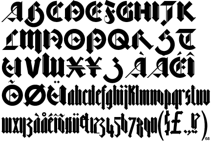
Bastard was designed by Jonathan Barnbrook and the Virus Foundry in 1990 and is classified as a geometric blackletter typeface. It is offered in three different weights, spindly bastard, fat bastard, and even fatter bastard. Barnbrook would say that it is a modern take on a historic font. Though it was digitally drawn, The typeface looks almost handmade with an angular nip strokes (as if it were being made from a pen). It draws much of its name from the font classification, Bastarda, which is designed around simple letterforms and would have been used in the 14th and 15th centuries for copying texts of little importance. The font is extremely geometrical and avoids the use of curved strokes.
6 Characteristics
Geometrical
Angular nip like strokes (as if drawn by pen)
Very tall x-height
Some use of thin to thick stroke contrast
Many letters in the font use slab serifs (but not all---some thin, some have no serif at all)
Some circular arcs
All counters are intersected in some way
Part C
What happened in 1990?
-considered the last year of the Cold War
-Exxon Valdez trial
-Hubble telescope launch
-The Gulf War --- Iraq invades Kuwait
-East and West Germany reunify
-The British Art Show at Hayward Gallery takes place
-The Art Strike of 1990-1993 begins (has little effect on the galleries)
-The end of Total Enlightenment (Moscow conceptual art)
Bibliography:
Printed:
The Barnbrook Bible, Jonathan Barnbrook, 2007
type's political prince, Abbott, Print, Nov/Dec2007, Vol. 61 Issue 6, p302-303
Visuals; Words into type, Heller, New York Times book review, 9/ 9/2007, p18
Russoff, M. Friendly Fire: The Graphic Design of Jonathan Barnbrook, Crafts (London, England) no. 208 (September/October 2007) p. 72-3
Dear Mr Barnbrook…, Creative Review; Jun2007, Vol. 27 Issue 6, p40-44
Online:
http://www.typographer.org/archive/mag-interview-barnbrook.html
http://www.barnbrook.net/
http://en.wikipedia.org/wiki/Jonathan_Barnbrook
http://www.designmuseum.org/designinbritain/jonathan-barnbrook
http://en.wikipedia.org/wiki/Bastard_(typeface)
http://www.creativereview.co.uk/crblog/barnbrook-asks-designers-to-remember-tibet/
http://www.designboom.com/weblog/cat/8/view/3598/remember-tibet-by-jonathan-barnbrook-and-pedro-inoue.html
http://www.remembertibet.org/
http://www.virusfonts.com/

