Monday, January 26, 2009

Typography Journal 1 and Homework (1.26.09)

 
Series: a number of books, pamphlets, or periodicals brought out by one company or organization on the same or related topics or in the same format.
 
Sequence: a number of things arranged in a particular order or connected in some way, or a number of actions or events that happen one after another. 
 
Sign: An item that directly represents what is being depicted.  A picture of a bird says bird.  The woof of a dog can also be a sign for dog.
 
Index: An item that refers or points the viewer in the direction of a related idea.  A nest can point to a bird. Accents can point to a specific geographic area.
 
Symbol: An item that is directly substituted for another item.  The written word 'bird' means the feathered flying animal that we visualize as bird.  The word bird can also be spoken, and carry with it many other associated items.
 
What makes a successful book jacket?
 
I think a successful book jacket is one that brings something unexpected to the table.  With the slew of books that sit on the shelf at any given bookstore, it isn't enough to just have straightforward text and an image that just scratches the surface of the context of the book. A book jacket needs to be able to grab the attention of the viewer from across the room, and then while or after reading the book, the cover should also serve to enhance the content of the book in hindsight.  I personally also enjoy when the design of the cover brings some dimension to the 2D surface of the jacket. 


Who is Chip Kidd? Why is he important to us?
 
Chip Kidd is an American graphic designer that is best known for his book cover designs. In fact, he is probably the best known designer for book covers. The covers are marked by innovation and interesting twists that are subtle and take consideration on the part of the viewer to understand their relation to the context of the book.  His designs many times seem to have a vintage feel to their presentation.  He has truly invigorated the design of books unlike any other designer.
 
 
Who is John Gall? Why is he important to us?
 
John Gall is an American designer best known for his work designing book covers. He is an art director within Randomhouse publishers. He generally allows the imagery of the cover to speak the loudest, with text serving as a subtle accent to the design.  I find myself adhering to the feelings that Gall has for what a constitutes a good book cover (surprising, unexpected).


10 Favorite Covers
(1)(2)(3)
(4)(5)
(5)(6)
(7)(8)
(9)(10)


Index (x3):
 
Cover #1- A wolf at the table is well represented by the fork, which easily points to mealtime for a western audience.  When combined with the idea of the wolf, it furthers the idea as a furious, carnivorous animal that is driven by food.  The claw-like nature of the fork ties the animal nature of the imagery even further and the use of red makes it even more aggressive.
 
Cover #2- A General Theory of Love is shown well with the two chairs, side by side.  This alone points to the companionship of love, but when one of the chairs is shown leaning in on the other, it provides and even stronger feeling of a relationship between these inanimate objects.  This use of the color red also relates to the idea of love within our culture.
 
Cover #3- Good evening Mr. and Mrs. America gives the idea of olden times with the type of radio that is presented.  The idea of a stand alone radio in of itself sets a tone for the book at being a past generation. The typeface and the way it is incorporated with the imagery furthers this idea. 


Series to Redesign: How to be a Gentleman (A Contemporary Guide to Common Courtesy), A Gentleman at the Table (A Concise, Contemporary Guide to Table Manners), A Gentleman gets Dressed Up (What to Wear, When to Wear It, How to Wear It)
 
Author: John Bridges
 
Genre: Etiquette
 
Book and Author information:
 
Author: John Bridges is the senior editor for the Nashville Scene. His weekly column, "Keeping Up," is syndicated in independent news weeklies. A collection of his columns has been published as Keeping Up: Blue Blazers, Iced Tea, and Everthing Else Worthwhile in Life.
 
How to be a Gentleman: In a world of cellular phones, express lanes, business lunches, and political correctness, being a gentleman seems to be more and more complicated. Gentlemanly behavior, says John Bridges, is not about do's and don'ts, but about common sense and courtesy. A gentleman does not use his cellular phone during a concert, nor does he borrow more money than he can afford to pay back. He always puts the toilet seat down. He asks for directions when he is lost, and he knows how to order a bottle of wine. How to be a Gentleman is a book for men that combines Emily Post and Miss Manners without being snobbish, boring, or intimidation. Good manners means thinking of others, being there when you are needed, and getting out of the way the rest of the time. This book makes it easy to be a gentleman. A true gentleman is comfortable with traditional etiquette, and guidelines on the traditional are included her as are more modern points of etiquette such as how to respond to voice mail and answering machine messages and how to deal with email in a courteous manner. How to Be a Gentleman is an indispensable guide for men of all ages who aspire to become gentlemen.
 

A Gentleman at the Table: A Gentleman at the Table will give any man the knowledge he needs to maneuver any dining situation – from a casual meal of fried chicken at his mom's house to a seven-course dinner at the finest restaurant in the world. It includes. . .

      How to set a table

      How to pronounce more than 100 unusual food names

      How to use obscure eating utensils

      How to perform the Heimlich maneuver

      How to eat more than 25 foods that are challenging to eat gracefully such as lobster, snails, fried chicken, and pasta.

In a society where more and more people eat with plastic forks and spoons at fast food restaurants, it is still important that a man know proper dining etiquette. There are still situations where not knowing what a finger bowl is or not knowing how to pronounce an item on a menu can have an effect on what others think of you. Showing he has little working knowledge of table manners at a lunch meeting or on a job interview over dinner may have an important impact on a man's life.

Like all the books in the GentleManners series, A Gentleman at the Table is easy to use, non-threatening, and an entertaining read.
 

A Gentleman gets Dressed Up: A Gentleman Gets Dressed Up is not a book about style--it is a book about the rules--rules that will allow any man to feel more comfortable in the choices he makes about what he wears. It answers such questions as: What does black tie optional mean? What do I wear to a wedding at 7: 00 on a Saturday evening? What do I wear to a job interview? What do I wear to a second interview, even if they observe a casual dress code? What do I wear to the Academy Awards? What do I wear to a funeral? And what button do I leave open on my suit coat?

This GentleManners book is divided into sections about specific items of clothing and specific accessories. It also delves into the different types of events to which a gentleman may find himself invited. The book concludes with sections on extreme etiquette, such as what to wear to meet the pope, and a section on fashion emergencies, such as what to do when your pants split.

      A gentleman knows that dressing up may require going to great pains; but it does not require that he feel any pain at all.

      A gentleman knows that a formal shirt does not have a button-down collar.

A colorblind gentleman is not ashamed to mention his disability to a clothing salesperson and to ask for assistance in selecting a shirt or tie to match a suit.
 
Associate Word List:
Sophisticated
Intellectual
Elegant
Stately
Formal
Courtly
Graceful
High-class
Dress
Manners
Behavior
Conduct
Demeanor
Class
Common sense
Courtesy
Civility
Politeness
Behavior
Etiquette
Guide
Clean
Simple
Involving
Engaging
Thought provoking
Introspective
Classy
Posh
Intriguing
Riveting
Exciting
Gripping
Absorbing
Intellectual
Polished
Intelligent
Wise
Knowing
Style
Sage
Advisable
Sensible
Recommended
Ethics
Rule
Govern
Regulation
Standard
Guidance
Counsel
Direction
Signal
Advocate
Advisor
Advise
Suggest
Dinner
Wine
Tablecloth
Silverware
China
Cufflinks
Tie
Deep colors
Bow tie
Luncheon
Suit
Patten leather shoes
Civility
Politeness
Courtesy
Social world
Grace
 
 
Define 10:
 
Civility:
1.the formal politeness that results from observing social conventions
2.something said or done in a formally polite way
 
Ethics:
1.the study of moral standards and how they affect conduct (takes a singular verb)
Also called moral philosophy
2.a system of moral principles governing the appropriate conduct for an individual or group (takes a plural verb)
 
Classy:
very stylish and elegant (informal)
 
Simple:
to make something less complicated or easier to understand
 
Formal:
1.characterized by or organized in accordance with conventions governing ceremony, behavior, or dress
2.done or carried out in accordance with established or prescribed rules
3.done in an organized and precise manner
 
Elegant:
1.stylishly graceful, and showing sophistication and good taste in appearance or behavior
2.executed or made with a combination of skill, ease, and grace
3.satisfyingly and often ingeniously neat, simple, or concise
 
Sophisticated:
1.knowledgeable about the ways of the world, self-confident, and not easily deceived
2.appealing to or frequented by sophisticated people
 
Intellectual:
3.intended for, appealing to, or done by intelligent people
somebody with a highly developed ability to reason and understand, especially if also well educated and interested in the arts or sciences or enjoying activities involving serious mental effort
 
Counsel: coun·sel n
2.somebody whose advice is sought, or who acts as an official adviser (takes singular or plural verb)
3.advice sought from or given by somebody, especially somebody who is wise or knowledgeable (formal or literary) (often used in the plural)
1.to advise somebody on a particular course of action (formal or literary)
2.to give somebody advice and support on personal or psychological matters, usually in a professional context
 
Sage:
somebody who is regarded as knowledgeable, wise, and experienced, especially a man of advanced years revered for his wisdom and good judgment (literary)
 
having or showing great wisdom, especially that gained from long experience of life (literary)
 
Tone: Books are serious, informative, and somewhat how-to.  They are non-fiction. 
Encouraging, uplifting, wise
 
To Suggest:
 
To suggest that gentleman courtesy can be attained.
To suggest a feeling of civility.
To suggest a feeling of elegance.
To suggest moral standards.
To suggest a feeling of class.
To suggest an understanding of proper societal interaction.
To suggest a way to personal betterment.
To suggest a way to enhance personal and social interaction.
To suggest a level of maturity.
To suggest guidelines of traditional etiquette.
 
Quotes:
(1) A gentleman is someone who makes others feel comfortable. Good manners is simply a matter of common sense and courtesy.
 
(2)  The truth of the matter is, being a gentleman is not rocket science. Being a gentleman requires a little logic, a bit of forethought, and a great deal of consideration for others. It is not about complicated rules and convoluted instructions. Instead, it is about honestly and sincerely being a nice guy.
 
(3) Simply acting like a gentleman is not enough. It is being a gentleman that is important, and that means thinking of others, being there when you are needed, and knowing when you are not needed. It is what you do and who you are—an accumulation of gentlemanly behaviors over the course of a lifetime—that make a man a gentleman.
 
(4) Chivalry is described as gracious courtesy and high-minded consideration - exactly what sets a man apart from the rest.
 
(5) The True Gentleman is the man whose conduct proceeds from good will and an acute sense of propriety, and whose self-control is equal to all emergencies; who does not make the poor man conscious of his poverty, the obscure man of his obscurity, or any man of his inferiority or deformity; who is himself humbled if necessity compels him to humble another; who does not flatter wealth, cringe before power, or boast of his own possessions or achievements; who speaks with frankness but always with sincerity and sympathy; whose deed follows his word; who thinks of the rights and feelings of others, rather than his own; and who appears well in any company, a man with whom honor is sacred and virtue safe.
 
(6)  A gentleman knows that clothes do not make the man. But he knows that, when making a first impression, his wardrobe may speak louder than his actions—perhaps even louder than his words.
 
(7) I hold an open door, 
the last to enter. 
Gentleman am I, 
I'm told, 
contained, controlled. 
That I could action on 
a want 
or need? I doubt, 
too timid to take a lead. 
I have no need or want 
to act 
for fear perhaps, 
not of rejection 
but 
victory's plaque.  
 
(8) A gentleman always thinks before he speaks. He also thinks after he speaks, in order to build on the rightness, or correct the wrongness, of what he might have said.
 
(9) When a gentleman speaks, he hopes to sound wise, or—at the very least—he hopes to bring a smile to someone's face. He never uses words to harm or demean another person. Even when he is silent, he can be eloquent, offering a listening ear or a shoulder for a friend to lean upon,
 
(10) [The gentleman's] goal is to make life easier, not just for himself but for his friends, his acquaintances, and the world at large.
 
Concept Statement:
 
When you think of the rules of etiquette, do people like James Bond come to mind? Etiquette is not reserved for soave stars and your daddy's golf buddies. Etiquette is a common courtesy that every man should not only be aware of, but incorporate into their daily lives. In a world that rarely stops for a please and thank you anymore, a man who can learn to live within the bounds of pleasant social interactions can shine amongst the rest.

Etiquette does not consist of social graces that are reserved for the chosen few of society, nor is it so complicated that the average man is incapable of learning it.  Etiquette is common courtesy, not rocket science. It demands that the gentleman be aware and caring of those around him, and that this is not a forced set of ideals, but rather something that flows naturally from what is within him.  Furthermore, he daily welcomes this not as an obligation, but rather as a challenge.

Etiquette everyday becomes a greater need of the society in which we live.  With even the simplest of common courtesy being lost in the winds of those that would rather save two seconds and inconvenience those around them, even pleasantries such as 'excuse me,' 'please,' and 'thank you' are being lost.  This is not some sacred art that is meant to be practiced only by those who have removed themselves from society or those that are born into good manners.  It is the responsibility of all men to acquire a good set of social skills for the betterment of themselves, and the world around them.
 
Audience Persona:
 
Jim is like any other American boy, except for one thing.  While growing up Jim is daily taught in the ways of appropriate social interactions and common courtesy. Jim learns how to set a formal table, what appropriate dress is for school, a job interview, and a first date, and how to deal with his friends and acquaintances in a respectful way.
 
This may or may not translate to better jobs, the woman he marries, or even the life he passes to his children, but it will most certainly define the way that he is respected and appreciated by those around him, because they receive the same respect from him at every interaction.

Tuesday, January 20, 2009

Graphic Design: first reading

1. Does this semiotic concept process always follow a certain line of events (as listed in the reading - Sender, Intention, Message, Transmission, etc...) or can the designer choose the order, or consider multiples at once? 

2. The reading lists large groups, such as countries, when it talks about metaphors, Synecdoche, etc, but I assume that the groups that this can be applied to are can be various, focused, and specific.  Is this so?

Monday, November 24, 2008

Type Definitions (in progress)

Typographic Rules and Terms

-- Parts of the grid: what are the following:

margin- the space that surrounds the content of a page

column- a column is one or more vertical blocks of content on a page

alley- the space between columns within a page

module- The typography module sets a base text size, color and font for the page. It also sets default styling of margins, line-spacing (leading) and font size, for the headings and paragraphs.

gutter- the space, at which two pages come together in a two-page spread

folio- A sheet of paper folded in half to make two leaves in a codex

-- What are the advantages of a multiple column grid?  It brings the ability for dynamic and endless design combinations.  It also brings greater readability in many cases

-- Why is there only one space after a period?

Letters take up a proportional amount of space (the space after punctuation is already compensated for), whereas on a typewriter all letters are monospaced and, therefore need a double space after each sentence.

-- What is a character (in typography)? A letter or punctuation (anything within a font) that is used to convey information.

-- How many characters is optimal for a line length? words per line? 25-70 characters per line is appropriate.  5 words per line to 14 words is also a comfortable amount. (avg of 5 characters per word)

-- Why is the baseline grid used in design? It creates visually appealing connections between blocks of text and other elements.  It assures that all of these line up.

-- What is a typographic river? A typographic river is when text is justified and the word spacing creates empty spaces within a block of text that flow unbroken vertically.

-- What does clotheslining or flow line or hangline mean? A flow line is a design element where all text and graphics in a design line up to create a horizontal flow across the layout and thereby draw the viewer's eye across the page.

-- How can you incorporate white space into your designs? You can incorporate white space through cut-outs in columns of text and by placement of text or graphics within the grid.  White space can provide a certain rhythm to layouts as long as awkward absences and shapes are avoided.  

-- What is type color/texture mean?  The designer can use the leading and kerning of a text to his advantage to create heavier/darker areas on the page and lighter areas of the page through nothing but text.  This can add greatly to the rhythm of the layout.  

-- What is x-height, how does it effect type color? X-height is the height of lower case letters in a font (defined by the height of the lower case 'x') and as such a taller x-height results in a more full looking block of text.

-- Define Tracking.

the amount of space between a group of letters to affect density in a line or block of text

-- Define Kerning.

the process of adjusting letter spacing in a proportional font

Why do characters need to be kerned? Because not all letters take up the same amount of lateral space, it is necessary to compensate for the wider and narrower letters.  By doing this it makes them look evenly spaced, when in fact they are not.

What are the most common characters that need to be kerned (kerning pairs)? AC, FA, WA, and OA.

-- In justification or H&J terms what do the numbers: minimum, optimum, maximum mean? In justification it defines the the minimum, optimum, and maximum percentage of spacing between words to accomplish the justification.

-- What is the optimum space between words? It must be wide enough to recognize separate words, while being narrow enough to keep the sentence cohesive. 

-- What are some ways to indicate a new paragraph. Are there any rules?  Hanging indent, and indenting the first line.  Indents should always be made by setting tabs, not by spacing.

-- What are the rules associated with hyphenation? No more than three lines of text in a row ending in a hyphenation, hyphenate between syllables, don't hyphenate headings

-- What is a ligature? the combination of letters into a new form for the aide in printing 

-- What does CMYK and RGB mean?

CMYK- Cyan, Magenta, Yellow, Key (black)

RGB- Red, Green, Blue

-- What does hanging punctuation mean? In justified text when punctuation is allowed to extend into the margin.

-- What is the difference between a foot mark and an apostrophe? 

What is the difference between
an inch mark and a quote mark (smart quote)?

-- What is a hyphen, en dash and em dashes, what are the differences and when are they used.

The em is equal to the size of the text being used.  The en is half the length of the em (or half the size of the text being used) and a hyphen is a third of the length of the em.  

-- What is a widow and an orphan?


Widow- the final line of a paragraph if it falls at the top of the following page [or column] of text


Orphan- the first line of a paragraph if it appears on its own at the bottom of a page [or column]

Monday, November 10, 2008

Jonathan Barnbrook


Part A


            Jonathan Barnbrook is a typographer and type designer who now lives and runs his own type design studio in London, named Virus.  His many successes in the world of typography during the 90’s made Barnbrook one of the most influential voices in the industry.  He is also very well recognized for the album work he did for David Bowie which featured his typeface Priori and is also one of the most recognized designers in modern Japan.


Originally  Luton, England (born in 1966), Barnbrook found his early inspiration in record labels saying that music “was a form of rebellion and also a way to relate to the world. Record covers enhance your enjoyment of music, the graphics make the whole experience more meaningful in some way.”  The world of design began for him at the age of 13 when he won a design competition for his school’s magazine cover.  He struggled with design until he turned 20 and realized that there was more to designing than getting a commission and pleasing a client. 


Barnbrook gained formal artistic training through Central St. Martin’s and the Royal College of Art and though he would describe himself as a product of the London schools, he recognizes that the art schools that he attended have had less of an influence on his work than what he refers to as “the spirit of the times.”


It was during college in 1989 when Barnbrook first began experimenting with designing type.  He did this because of the need that he felt to have complete control over a design.  He asked himself what the worth of controlling the photography and layout of a design was while being constricted by someone else’s typeface.  Beyond that he didn’t feel that typeface’s at the time could express what was going on around him.  With those reasons, he began designing for himself.  


He mentions deconstructivism in the 90’s as a source of influence, but it is a minor point and suggests that the world around him, not a particular artistic movement is the source of his main influence.  This is best expressed in his own words as seen in the following interview question:


What are your main influences, or are you an island?

My main influences. Well the first is an inner anger which is a response to all the unfairness that is in this world. I don't know if this is a strange or embarrassing thing for a designer or typographer to say because the older notions of being a graphic designer are about being an invisible communicator and I believe without having confidence in the way the world is moving forward you cannot be unquestioning and invisible. The second which is a direct opposite is trying to express some of the beauty of the world - not just of letterforms but of living and of people. My work has been criticized for being too 'depressing' but I am just trying to show the possible beauty of life through showing the immense contradiction of what we have and what is possible.

I am not sure what being an island means - if you mean am I an individual that exists on my own with my own philosophies - yes I have my philosophies but, I am not arrogant enough to think that what I do is unique, there are other people trying just as hard, also I am a product of my time of my culture of my family and this is something I have to acknowledge, what I do today will be a result of this - tomorrow I will think differently and hate what I did today but I still come from the same strong position which is conditioned by these factors. (http://www.typographer.org/archive/mag-interview-barnbrook.html)


Barnbrook’s first font was Bastard and was designed while he was attaining his masters degree.  The typeface draws its name from typographic classification known as Bastarda, which is designed around simple letter forms.  The typeface avoids curves and is extremely geometric in its construction. 


Bastard isn’t the only typeface that Barnbrook has named controversially.   He has named fonts Manson, Tourette, Prozac, Infidel, Moron and Exocet. Hidden within these names lies an understanding about much of what Jonathan Barnbrook views as his place in the design world.


An excerpt from an interview (shown here), shows Barnbrook’s philoshopy on his font naming process.


“It is very important, in the past a typeface would take years so it was almost a life’s work. Therefore people would often use their surname. There was also the ‘Letraset’ school of naming which was to name after a visual pun to do with the typeface. Technology has changed the time taken and access for producing typefaces so it can be done be individuals on a much quicker timescale. I suppose I see it as a cross between naming a pop song and a painting. The name can be throwaway – last for a moment but it can also have many different layers. The name 'bastard' for instance I thought about a lot. The typeface is a blackletter (or gothic) font. It has strong associations with Fascism. It would have been silly to ignore this, even though blackletter has a large place in the history of typography most people would associate it with the Nazis, so it was a chance to almost laugh at that. But if you bother to look further into the name, you will know that there is a 14-15th century form of blackletter called ‘Bastarda’ or that putting the ‘wrong font’ in a piece of letterpress setting is called ‘bastard type’. Also it is not form a pure family of black letter forms- a mixture of textura and fraktur, so in this sense it is a bastard child of them.

There is also the fact that typography always deals with language, so you have the conflict of the spoken word and the visual mark that expresses the spoken word and the abstract thought behind it. All I am trying to say is that naming a font is incredibly important – there is a tension there, which can be played with.” (www.virusfonts.com)


These explosive social commentaries aren’t always restricted to the names of typefaces.  He often combines imagery of company’s logos to create designs that work for his social causes.  A prime example is his design that combines the Shell Oil company’s logo with Jesus as a commentary on the gulf war.  The image replaces Jesus’ halo with the shell logo and under the image of Jesus is the word pray with the American flag transformed into a blue and red barcode. Barnbrook justifies his active voice in by saying that he uses “design as a weapon” and that it is a result of “an inner anger which is a response to all the unfairness that is in this world.” 


Barnbrook isn’t just making arguments against war, he is looking for anywhere where he feels there is injustice and fighting to correct it.  This is seen very well by his recent launch of the website, http://www.remembertibet.org/, in which he requests those in the creative industry to make a statement in support of Tibet to raise awareness of the injustices taking place there.  On the website Barnbrook outlines how he feels that the arts have always played a role in bringing light to social injustices around the world.


YouTube Video

When asked about what he wanted out of the webspace Barnbrook replied as such:


“I don’t really want people to get hung up on the idea that this can change anything in isolation, it can’t. These works are just one tool of many which people will use to keep Tibet as a central issue in mainstream politics, as that is the only way things will change.” (http://www.creativereview.co.uk/crblog/barnbrook-asks-designers-to-remember-tibet/)


In 2007, Barnbrook released his autobiography, The Barnbrook Bible, which by his own account is meant to show his philosophy and beliefs about design, although as with most of his other work, there is a sarcastic almost cynical tone throughout the book.  As mentioned in his Bastard typeface, the layout of his book is extremely geometrical and even takes some time to chew through the designs to access the content of the book because of the intricacies of the layout.  A prime example of this is the way that Barnbrook lays out his table of contents.  Merely being able to understand what is in the table of contents is a chore.


Though I won’t include it all (because his list is quite extensive) I thought, with Jonathan Barnbrook being such a predominate modern type designer it would be useful to look at some of the things that he sees as important in type design and what we should be focusing on as we move through our typography classes.


What things really piss you off about typography? (highlights)

The fact that 90% of graphic designers do not know the basics of setting good text or even how to set somebody's address properly. When people come to see me with their work I am not interested in how flashy their work is. I much prefer it if they have learned the craft of typography…maybe because everybody wants to be a popstar designer they don't think these things are important - well they are. A plea to young designers - learn the basics, then your work will have the underlying authority to be subversive…

…Another thing that annoys is the amount of bad craftsmanship in letterform design. Well this annoys me less because it has always been there and always will be, it's not a result of the Macintosh. I just wish people would bother to use their brain a bit more before they design type, I think many are too eager to 'finish' a typeface rather than seriously contribute to the field of typography… (http://www.typographer.org/archive/mag-interview-barnbrook.html)

In 1997 Barnbrook started his own small type foundry with the purpose of creating innovative, usable, and experimental fonts.  As with when he started designing fonts in college, this foundry fuels the fonts for Barnbrook Design and gives Barnbrook complete control over his designs through personally created typefaces. There are two permanent members that are the head of Virus fonts, Barnbrook, of course, and his good friend, Pedro Inoue, from Brazil. Beyond that there are only a few other designers working at Virus at a time.

Barnbrook is still living and designing to this day, and is still a major player in the world of typography.  His experimental nature with type and the social commentary that he brings to his work has seemingly solidified his place in the modern creative world. 


Part B


Apocalypso

Bastard

Bourgeois

Coma

Delux

Doublethink

Drone

Echelon

Exocet

Expletive Script

False Idol

Infidel

Mason

Melancholia

Moron

Newspeak

Nixon Script

Nylon and Draylon

Olympukes

Patriot

Priori Sans

Priori Serif

Prototype

Prozac

Sarcastic

Shock & Awe

State Machine

Tourette

BASTARD


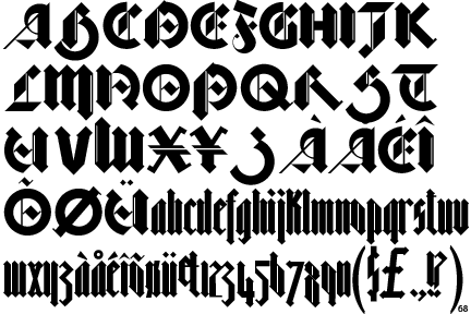
Bastard was designed by Jonathan Barnbrook and the Virus Foundry in 1990 and is classified as a geometric blackletter typeface.  It is offered in three different weights, spindly bastard, fat bastard, and even fatter bastard.  Barnbrook would say that it is a modern take on a historic font.  Though it was digitally drawn, The typeface looks almost handmade with an angular nip strokes (as if it were being made from a pen).  It draws much of its name from the font classification, Bastarda, which is designed around simple letterforms and would have been used in the 14th and 15th centuries for copying texts of little importance.  The font is extremely geometrical and avoids the use of curved strokes. 


6 Characteristics


Geometrical

Angular nip like strokes (as if drawn by pen)

Very tall x-height

Some use of thin to thick stroke contrast

Many letters in the font use slab serifs (but not all---some thin, some have no serif at all)

Some circular arcs

All counters are intersected in some way


Part C


What happened in 1990?


-considered the last year of the Cold War

-Exxon Valdez trial

-Hubble telescope launch

-The Gulf War --- Iraq invades Kuwait

-East and West Germany reunify

-The British Art Show at Hayward Gallery takes place

-The Art Strike of 1990-1993 begins (has little effect on the galleries)

-The end of Total Enlightenment (Moscow conceptual art)


Bibliography:


Printed:

The Barnbrook Bible, Jonathan Barnbrook, 2007


type's political prince, Abbott, Print, Nov/Dec2007, Vol. 61 Issue 6, p302-303


Visuals; Words into type, Heller, New York Times book review, 9/ 9/2007, p18


Russoff, M. Friendly Fire: The Graphic Design of Jonathan Barnbrook, Crafts (London, England) no. 208 (September/October 2007) p. 72-3


Dear Mr Barnbrook…, Creative Review; Jun2007, Vol. 27 Issue 6, p40-44


Online:


http://www.typographer.org/archive/mag-interview-barnbrook.html


http://www.barnbrook.net/


http://en.wikipedia.org/wiki/Jonathan_Barnbrook


http://www.designmuseum.org/designinbritain/jonathan-barnbrook


http://en.wikipedia.org/wiki/Bastard_(typeface)


http://www.creativereview.co.uk/crblog/barnbrook-asks-designers-to-remember-tibet/


http://www.designboom.com/weblog/cat/8/view/3598/remember-tibet-by-jonathan-barnbrook-and-pedro-inoue.html


http://www.remembertibet.org/


http://www.virusfonts.com/